


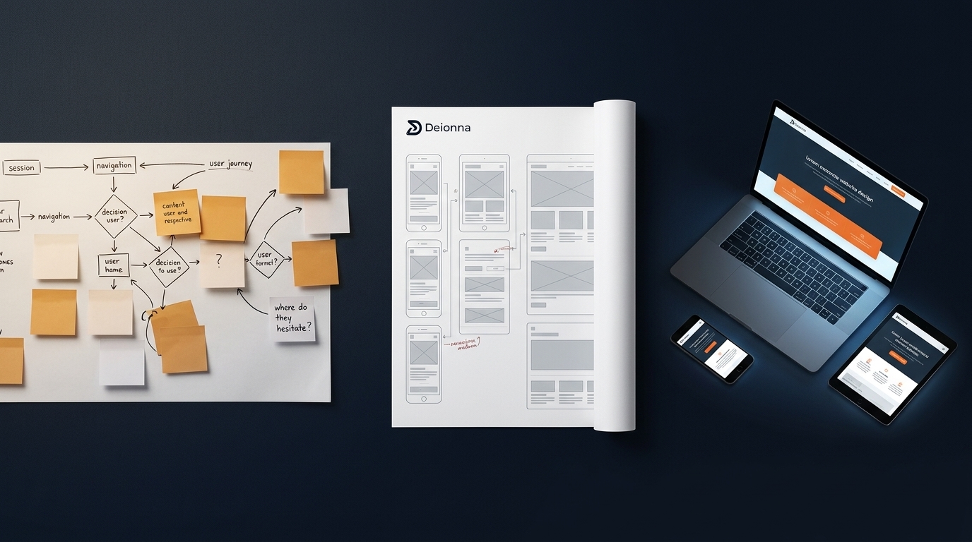
Forget the idea that a site works just because it looks good on desktop. You’ve seen how the same navigation can trip up users on phones and tablets. Starting with user research reveals those hidden snags before any design begins, shaping responsive wireframes that feel natural on every screen. This approach clears the path from curiosity to conversion, making your website a true lead generation powerhouse.
Starting with User Research
A successful website begins with understanding how users interact on different devices. By starting with this step, you ensure your design aligns with user needs.
Mapping User Journeys
By mapping user journeys, you can pinpoint how visitors move through your site. This involves creating scenarios to visualize paths users might take. For example, a customer might start at your homepage and end on a product page. By understanding these paths, you can tailor the site to guide them smoothly. This approach helps identify potential obstacles that could cause users to leave early.
Analyzing Heatmaps & Analytics
Heatmaps and analytics provide a window into user behavior. Heatmaps show where users click most, while analytics reveal patterns like time spent on a page. This data tells you what parts of your site work well and what needs improvement. For instance, if users aren’t clicking a crucial link, it might need to be more prominent. This analysis is vital for building a site that meets user expectations.
Insights Before Design
Gathering insights before jumping into design ensures you address real user needs. It’s about listening to users through surveys or A/B tests. This feedback informs decisions about layout and functionality. When users feel heard, they’re more likely to engage with your site. This step is crucial for creating a foundation that supports responsive design.
Crafting Responsive Designs
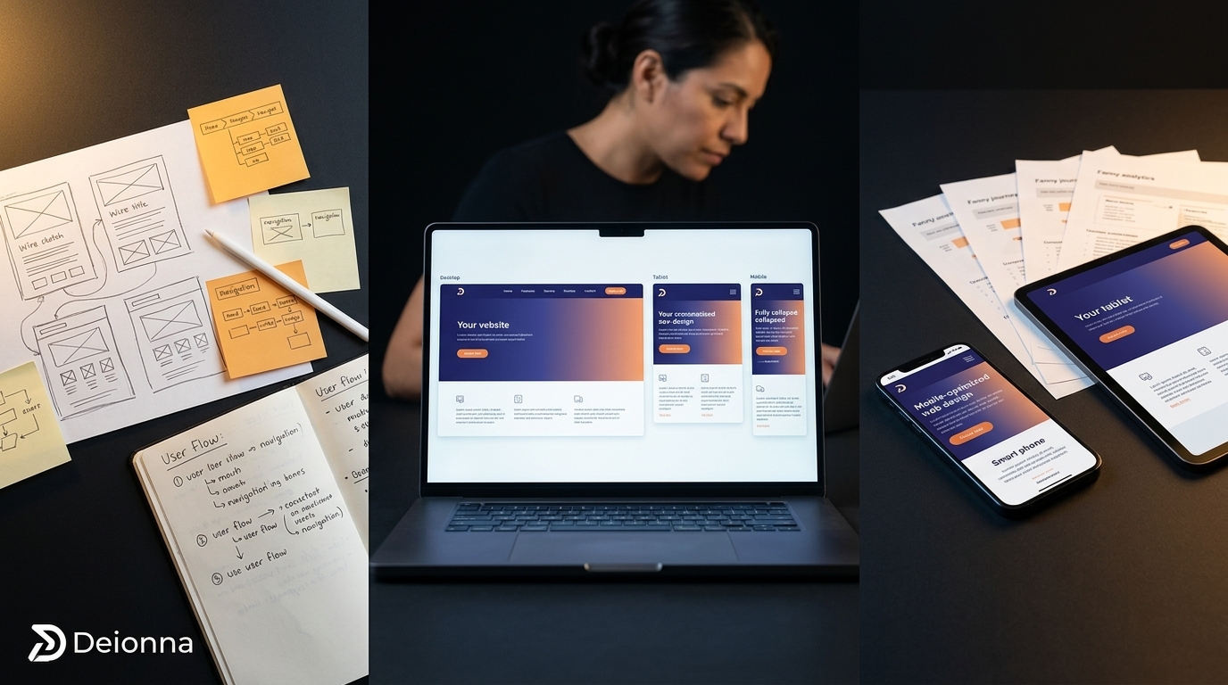
Responsive design ensures your website looks and works well on any device. This section explores the steps to achieve that flexibility.
Building Responsive Wireframes
Responsive wireframes serve as the blueprint of your site. They outline page layouts and functionality without visual distractions. This stage focuses on structure. For instance, a wireframe may show how a webpage’s layout adapts from a desktop view to a mobile one. It allows you to see the user flow and make adjustments early, reducing costly changes later.
Mobile-First Design Approach
Designing with mobile users in mind first means your site will work well on any device. Start by simplifying your layout for smaller screens. This method ensures essential elements fit within the screen’s limitations. As you expand to larger screens, you can add more features, maintaining a clean and functional design. This process results in a site that’s intuitive and engaging everywhere.
Ensuring Website Accessibility
Accessibility ensures all users, including those with disabilities, can use your site. To achieve this, follow WCAG guidelines by providing text alternatives for images and ensuring navigability via keyboard. Incorporating these elements enhances the user experience across the board. An accessible site is not only inclusive; it also broadens your audience.
Enhancing Conversion & Engagement

A responsive site sets the stage, but enhancing conversion and engagement keeps users coming back.
Optimizing CTAs for Success
Your calls to action (CTAs) guide users on what to do next. To optimize them, use clear and compelling language. For instance, instead of “Submit,” try “Get Your Free Guide.” Placement matters too: put CTAs where user attention naturally flows. Well-designed CTAs can significantly boost engagement and drive conversions.
Importance of Usability Testing
Usability testing reveals how real users interact with your site. Set up scenarios and observe: are they finding what they need quickly? This feedback helps you refine the user experience. Testing ensures your site is intuitive and meets user expectations. Regular testing can lead to continuous improvements and a better overall experience.
Monitoring Core Web Vitals
Core Web Vitals measure your site’s performance in speed, responsiveness, and stability. Use tools like Google’s PageSpeed Insights to monitor these metrics. For example, if your site loads slowly, consider compressing images or optimizing code. Keeping these vitals in check ensures a smooth experience that retains users and promotes engagement.
Frequently Asked Questions
What is user research in web design?
User research involves gathering insights about how users interact with your site. It includes methods like surveys and analytics to understand user needs and behavior.
Why is mobile-first design important?
A mobile-first design ensures your site is functional on all devices, starting with the smallest screens. This approach prioritizes essential content and features, enhancing the user experience on larger devices as well.
How does usability testing improve a website?
Usability testing involves observing real users interacting with your site. It helps identify areas of confusion or difficulty, allowing you to make improvements that enhance overall user satisfaction.



0 Comments