



Your website looks polished, but switching from desktop to mobile feels like a different experience altogether. That gap between devices frustrates users and clouds your brand’s message. By combining UX research with responsive design from the start, Deionna creates sites that stay clear, easy to navigate, and discoverable no matter the screen. Keep reading to see how this approach builds confidence today and supports your plans for growth tomorrow.
Understanding UX Research and Responsive Design
Let’s dive into why these two pillars are crucial for your website’s success.
Frustrations with Inconsistent Websites
Have you ever visited a site that looks amazing on your desktop, but turns into a nightmare on your phone? You’re not alone. Many people experience this daily. It happens because the website wasn’t designed with all devices in mind. This inconsistency frustrates users, leading them to leave your site. The key insight: a seamless experience keeps visitors engaged and builds trust. If your website doesn’t offer that, you’re missing out on potential customers.
Integrating UX Research for Clarity
To avoid this, integrating UX research is essential. It involves understanding how users interact with your site. Through studies and feedback, you gain insights into what works and what doesn’t. With this data, you build a site layout that guides users effortlessly. It’s about creating a path that’s easy to follow, leading to higher satisfaction. Think of your website as a map: clear directions keep users on the right track.
Responsive Design for Cross-Device Consistency
Responsive design is the bridge between devices. It adapts your site to fit any screen size, offering a consistent look and feel. No more pinching and zooming to read text. With this approach, you ensure that users have the same great experience, whether they’re on a phone or a desktop. It’s about making your website accessible to everyone, everywhere. When your design responds to user needs, it boosts engagement and keeps them coming back.
Implementing Research-Driven Design
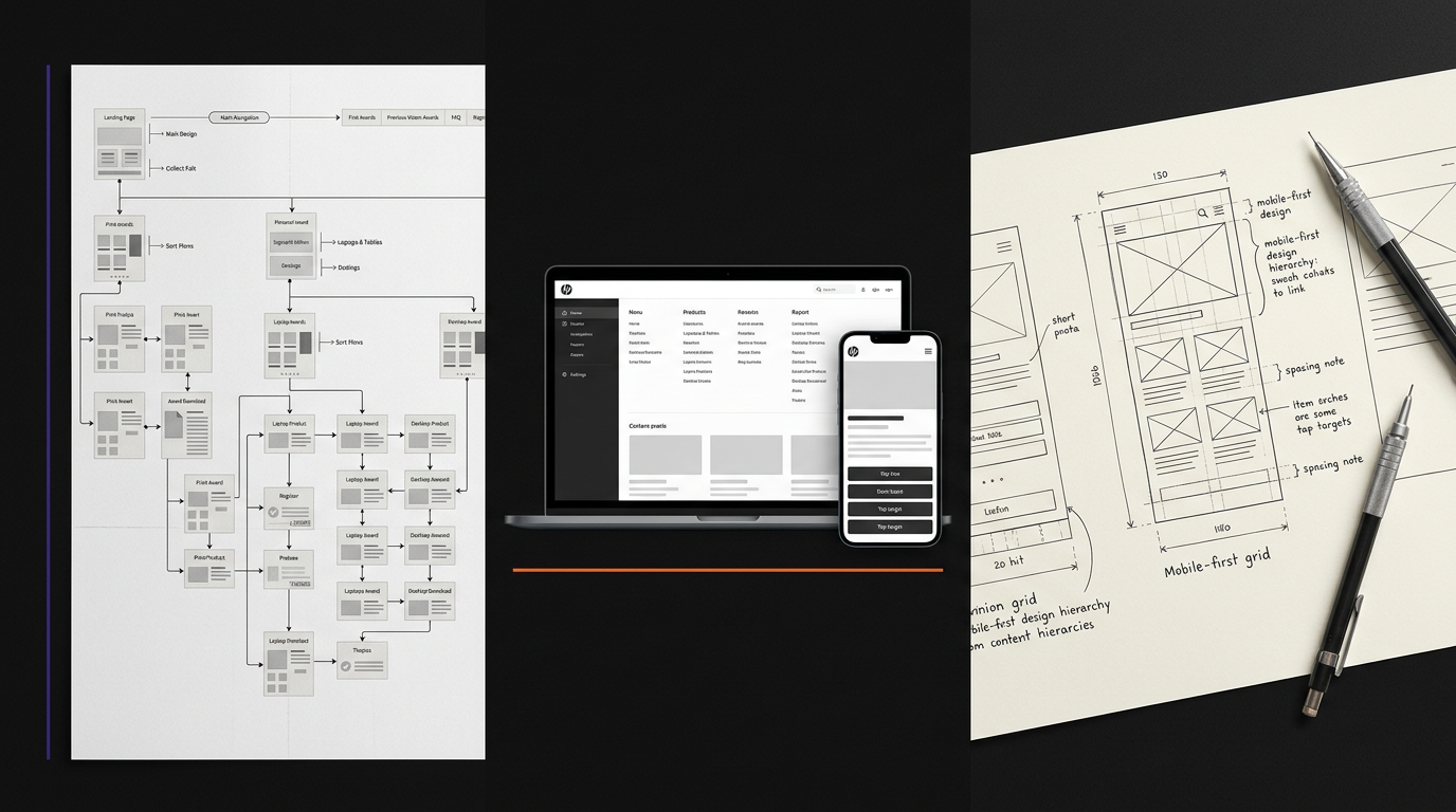
Now that we understand the importance of UX research and responsive design, let’s explore how to implement these practices for maximum impact.
User Testing and Customer Journey Mapping
Start with user testing to see how real people interact with your site. This gives you a firsthand look at the user experience. Next, map out the customer journey. Identify key touchpoints and potential pain areas. When you understand the journey, you can make informed design choices that enhance usability. It’s like piecing together a puzzle: each part must fit perfectly to create a complete picture.
Content Hierarchy and Navigation Clarity
Once you know how users move through your site, organize content accordingly. A clear hierarchy ensures that essential information stands out. Use headings and subheadings to guide users naturally. Navigation should be intuitive, helping users find what they need without frustration. Remember, a well-structured site not only looks good but also functions smoothly. This clarity is what sets your site apart from the competition.
Accessibility and Core Web Vitals
Accessibility is crucial for reaching a wider audience. Follow standards like WCAG 2.2 to make sure everyone can use your site. Also, pay attention to Core Web Vitals, which impact your site’s performance and user experience. A site that’s fast and easy to use keeps visitors engaged and reduces bounce rates. By focusing on these aspects, you create a welcoming environment for all users.
Planning for Growth with Deionna

With a solid foundation in place, it’s time to look ahead and plan for growth with Deionna’s expertise.
Mid-Year Planning and Q3 Strategy
Mid-year is a perfect time to evaluate your website’s performance. Use insights from the first half of the year to adjust your strategy for Q3. Deionna can help you identify areas for improvement and set new goals. By planning effectively, you position your brand for success in the coming months. Remember, proactive planning leads to sustainable growth.
Conversion Rates and SEO Discoverability
Improving conversion rates is a top priority for many businesses. By aligning UX research with responsive design, you enhance user experience, leading to higher conversions. Additionally, ensure your site is discoverable by optimizing for SEO. This increases your visibility and drives more traffic to your site. With the right strategies, you attract and retain more customers.
Book Your UX + Responsive Readiness Call
Consider booking a call with Deionna to prepare your site for future growth. Discuss your specific needs and explore how UX research and responsive design can elevate your brand. The longer you wait, the more opportunities you miss. Take action today and set your brand on the path to success.
Frequently Asked Questions
Why is responsive design important?
Responsive design ensures your website looks great on all devices, providing a consistent user experience. It adapts the layout to fit different screen sizes, making your site accessible to everyone.
What is UX research, and why do I need it?
UX research involves studying how users interact with your website. It helps identify areas for improvement, leading to a more user-friendly experience and higher satisfaction.
How does Deionna approach web design?
Deionna combines UX research with responsive design to create websites that are clear, discoverable, and consistent across devices. Her process focuses on the user’s needs, ensuring a seamless experience.
What are Core Web Vitals, and why do they matter?
Core Web Vitals are a set of metrics that measure your site’s speed, responsiveness, and visual stability. They impact user experience and play a role in search engine rankings.
How can I improve my site’s conversion rates?
Improving conversion rates involves optimizing user experience through UX research and responsive design. By making your site easy to navigate and visually appealing, you encourage users to take action.



0 Comments