


search
categories
recent posts
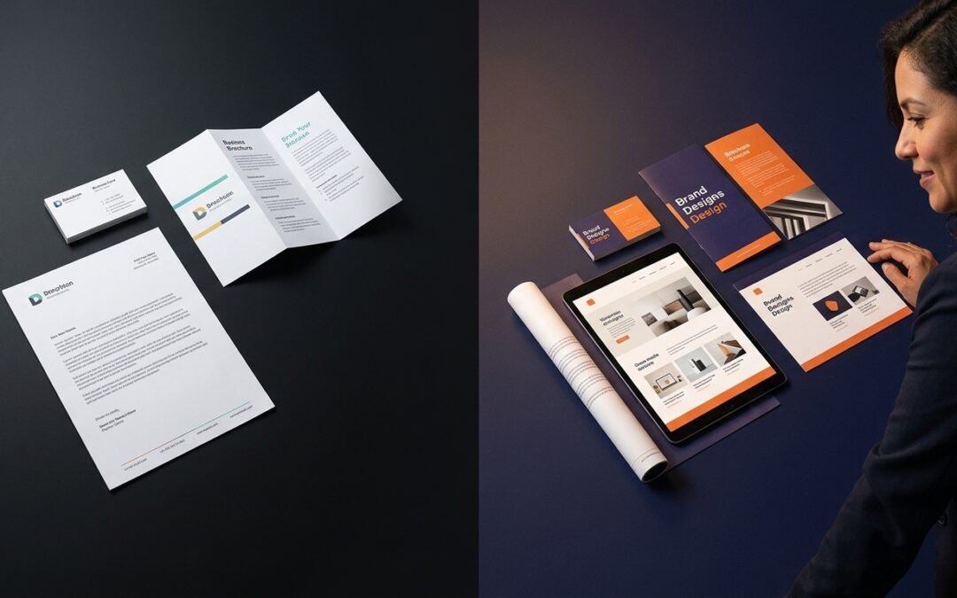
From Scattered to System: How Unified Design Turns Browsers into Buyers
Your website, print materials, and branding look polished but don’t feel connected. That scattered vibe creates confusion and makes it harder for people to trust your brand. When your logo, motion, and web design come from one unified brand system, every touchpoint...
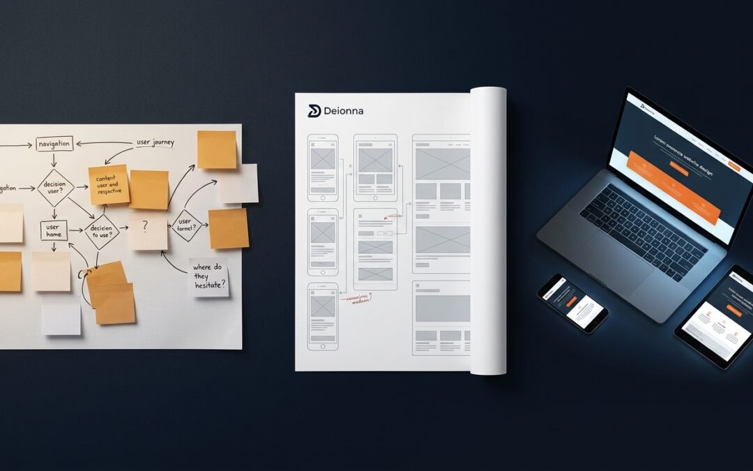
Research First. Responsive Always. Websites That Earn Trust on Every Screen
Forget the idea that a site works just because it looks good on desktop. You’ve seen how the same navigation can trip up users on phones and tablets. Starting with user research reveals those hidden snags before any design begins, shaping responsive wireframes that...
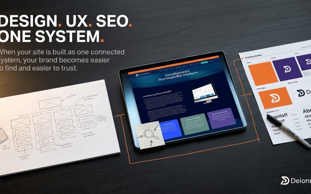
When Design, UX, and SEO Work as One: A Q3-Ready Framework for Findability, Clarity, and Consistency
You’ve spent months polishing your website, but traffic and engagement still fall short of expectations. The missing link? Aligning design and UX with a solid SEO strategy from the start. When these elements work as one brand system, your site isn’t just easier to...
tags
From Scattered to System: How Unified Design Turns Browsers into Buyers
Unified design systems unify logos, web, and print elements to build brand trust, boost recognition, and drive conversions by creating a cohesive, credible, and seamless customer experience.
Research First. Responsive Always. Websites That Earn Trust on Every Screen
Start web design with user research to create responsive, accessible sites that guide users smoothly across devices. Use wireframes, mobile-first design, testing, and core web vitals to boost engagement and conversions.
When Design, UX, and SEO Work as One: A Q3-Ready Framework for Findability, Clarity, and Consistency
Aligning design, UX, and SEO creates a unified brand system that boosts findability, clarity, consistency, and user engagement. Strategic Q3 planning includes reviews, redesigns, and clear goals.
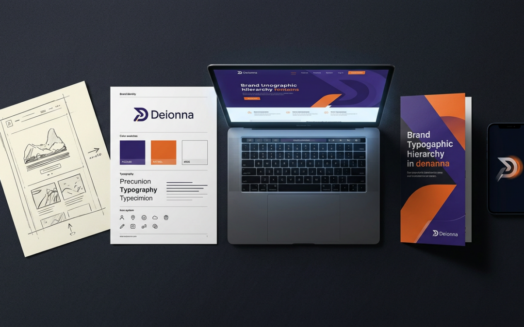
One Concept. Every Touchpoint. Cohesive Design from Sketch to Web, Print, and Motion.
Unified brand design across web, print, and motion ensures consistency, trust, and efficiency. Integrated systems, accessibility, and cross-disciplinary collaboration create cohesive, engaging brand experiences.