


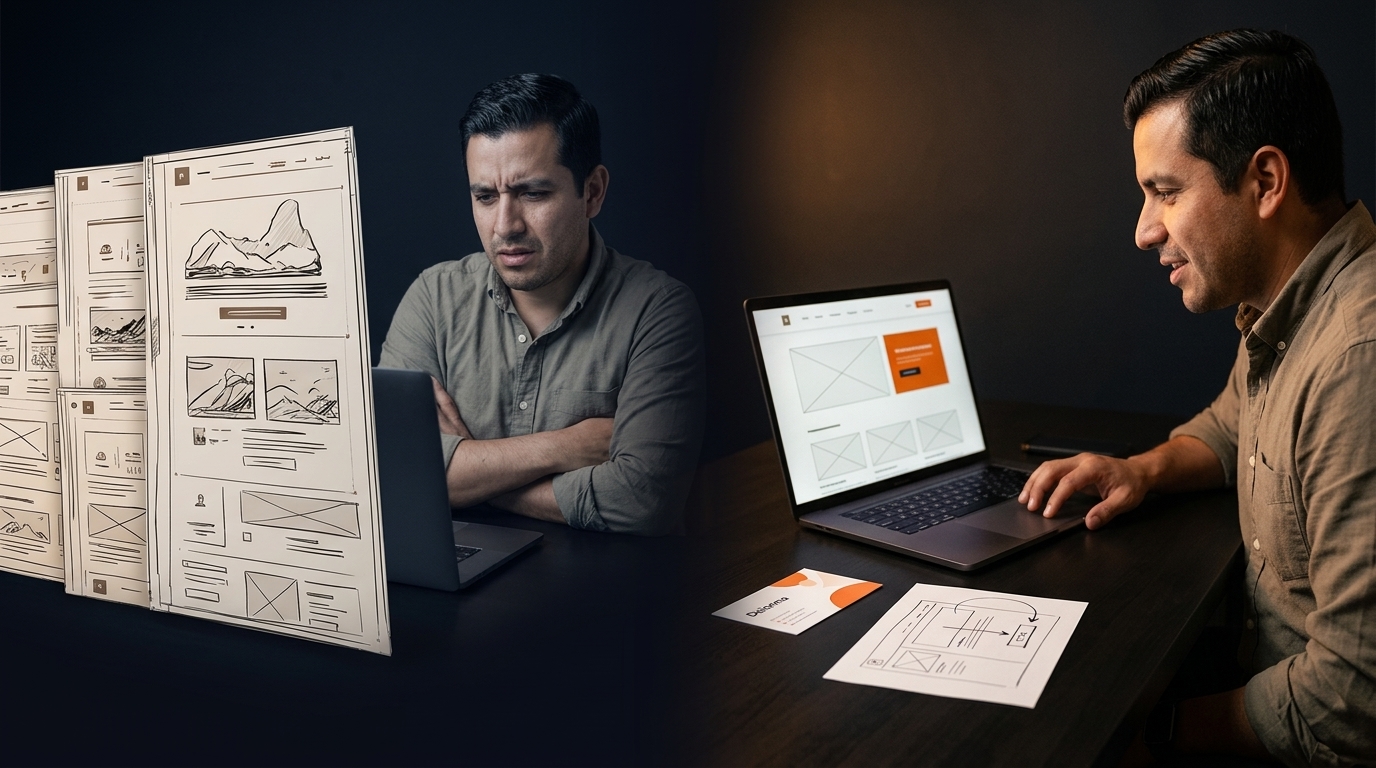
Your website looks great. Yet, visitors hesitate at the navigation, unsure where to click next. Small layout flaws quietly block the path from curiosity to contact. When July campaigns demand results, research-driven user behavior design becomes the key to turning browsers into leads. Let’s explore how thoughtful navigation and layout hierarchy can reshape your site’s story and boost conversions. Read more about enhancing user experience with seamless website navigation here.
Understanding Navigation and Layout
Navigating a website is like following a map. If the path isn’t clear, visitors get lost. Let’s see why user behavior design matters so much.
Importance of User Behavior Design
Understanding your audience is crucial. By tailoring your website to real user habits, you create a smoother journey. Imagine a visitor landing on your site. They need to find information quickly. If they encounter confusing layouts, they’ll likely leave.
By focusing on user behavior, you ensure visitors find what they need. This approach builds trust and encourages them to explore further. It’s about creating a path that feels natural. With this focus, your site becomes a helpful guide, leading visitors where you want them to go.
Role of Website Navigation in Conversion
Website navigation acts like a tour guide. A clear path can turn interest into action. Consider a visitor eager to learn more. If your navigation is intuitive, they find key information quickly. This ease boosts their confidence in your brand.
But if navigation is complex, frustration grows. They might give up and leave. Effective navigation keeps users engaged. It reduces bounce rates and increases conversion chances. Think of navigation as the first handshake. Make it firm and welcoming.
Layout Hierarchy and Its Impact
Good layout guides the eye. It highlights what’s important. When visitors land on your page, they scan quickly. Hierarchy ensures they see crucial elements first. This structure leads them naturally from one point to another.
A well-organized layout communicates professionalism. It shows care and attention to detail. More importantly, it helps convert curiosity into contact. By prioritizing layout, you direct user focus. Ultimately, this clarity can drive more meaningful interactions.
Practical Navigation and Layout Strategies
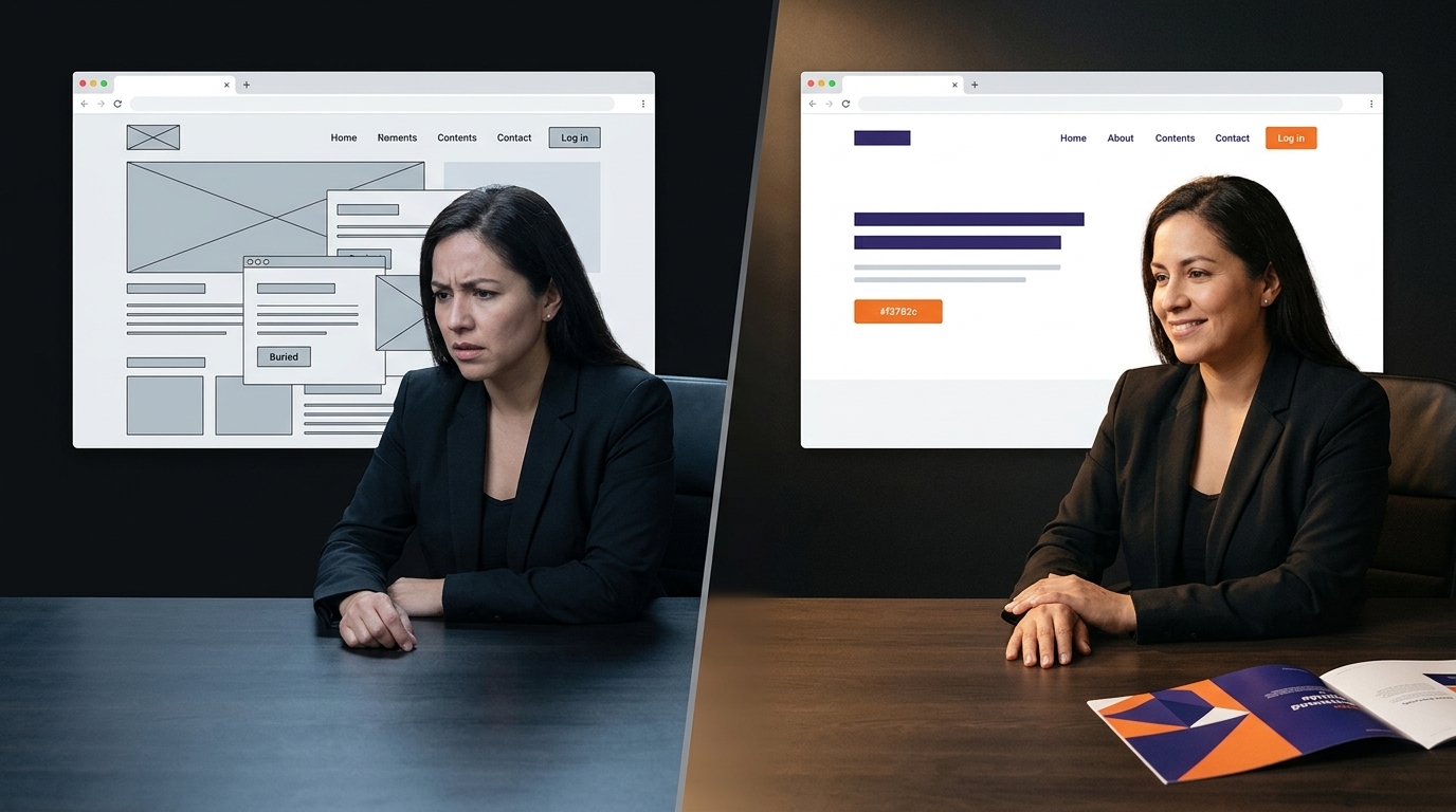
With a solid understanding of navigation and layout, you can now employ strategies that engage users effectively.
Call-to-Action Placement for Engagement
Calls-to-action (CTAs) are your direct invitations. Placing them strategically is key. Imagine a visitor reaching the end of a great article. A well-placed CTA nudges them to take the next step. This placement makes engagement feel seamless.
CTAs should grab attention without being intrusive. Use contrasting colors or bold text. Position them where users naturally look next. This approach respects the user’s journey, making it easy for them to act. Remember, a gentle nudge often leads to a strong response.
Using UX Research for Better Design
UX research provides valuable insights. By understanding user behavior, you make informed design choices. Consider a site redesign. With UX research, you know what elements work and what need change.
This research-driven approach tailors the site to actual user needs. It reduces guesswork and increases effectiveness. Users feel understood, leading to more engagement. Ultimately, design backed by research is a design that resonates.
Benefits of Mobile-First and Responsive Web Design
Today, users browse on various devices. Mobile-first design ensures your site performs well everywhere. Imagine a user accessing your site on a phone. A responsive design adapts, offering an optimal experience.
Mobile-first design prioritizes functionality. It focuses on core elements first, pleasing users on any device. This approach broadens your reach. By ensuring a smooth experience across platforms, you keep users satisfied and engaged.
Enhancing User Experience with Audits

Conducting regular audits can further enhance the user experience.
Conducting a Navigation Audit
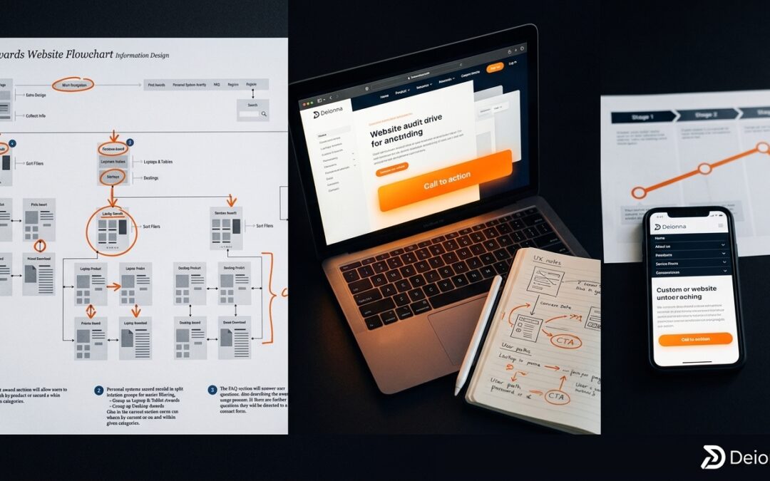
A navigation audit reveals what’s working. Start by mapping out your site’s structure. Identify areas where users struggle. Is there a common exit point? This insight guides improvements.
Regular audits keep your site fresh and effective. They uncover hidden issues that impact user experience. By addressing these, you streamline navigation, leading to better user journeys and higher conversions.
Using Heatmaps and Click Tracking
Heatmaps and click tracking offer visual insights. They show where users click most. This data highlights popular areas and potential frustrations. Imagine users often ignoring a key CTA. Heatmaps reveal this, prompting a reposition.
These tools guide layout and navigation tweaks. They point to areas needing attention, ensuring a user-friendly site. By leveraging these insights, you optimize user paths and boost engagement.
Conversion Rate Optimization Techniques
Optimizing conversion rates is about understanding user needs. Test different elements: headlines, CTAs, images. See what resonates most. A/B testing is valuable here. It provides direct comparisons.
Conversion optimization is ongoing. Regular tweaks based on data lead to better results. By focusing on user experience, you encourage more interactions. This proactive approach turns browsers into buyers.
Frequently Asked Questions
What is user behavior design?
User behavior design tailors website elements based on how users interact. It enhances navigation and layout to improve user journeys and increase conversions.
How does website navigation affect conversion?
Clear navigation guides users effectively, reducing frustration. It helps them find information quickly, increasing the chance they’ll convert.
What is a navigation audit?
A navigation audit evaluates a site’s structure. It identifies areas where users struggle and suggests improvements for a smoother experience.
How do heatmaps and click tracking work?
Heatmaps and click tracking show where users interact most on a site. They provide insights into user habits, guiding design adjustments.
Why is mobile-first design important?
Mobile-first design ensures a site performs well on all devices. It prioritizes core elements for a seamless user experience, broadening reach and engagement.

0 Comments