


blog
/ discover the news
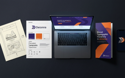
One Concept. Every Touchpoint. Cohesive Design from Sketch to Web, Print, and Motion.
Unified brand design across web, print, and motion ensures consistency, trust, and efficiency. Integrated systems, accessibility, and cross-disciplinary collaboration create cohesive, engaging brand experiences.

People First, Device Ready: How UX Research + Responsive Design Make Your Website Clear, Discoverable, and Consistent
Combining UX research with responsive design ensures your website is clear, consistent, accessible, and discoverable across devices, boosting user satisfaction, SEO, and conversion rates.
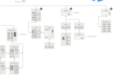
From Screen to Sheet: How a consumer-centric design process makes your brand intuitive across digital and print
A consumer-centric design process ensures brand consistency and trust by aligning digital and print materials, mapping user journeys, and using unified systems like component libraries and guidelines for seamless omnichannel experiences.
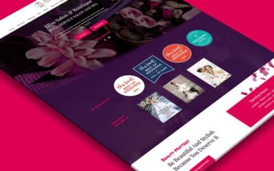
Summer Refresh, Reframed: Make Your Website Intuitive—Not Just Polished
Focus summer website refreshes on intuitive, user-centered design that guides visitors seamlessly, aligns messaging, optimizes conversions, ensures mobile responsiveness, and maintains brand consistency.